Transforming HydrogenPay's Design System: From Fragmented to Unified (Poseidon DS)
Role
Head of Product Design :
Led the design system strategy,
component architecture, naming
conventions, and Figma libraries.
Tools
UX / UI Design
Figma
N8N
Lovable
Timeline
10 Months
Teams
11 Designers, 4 Engineers, 3 PMs, Marketing, Data, Leadership
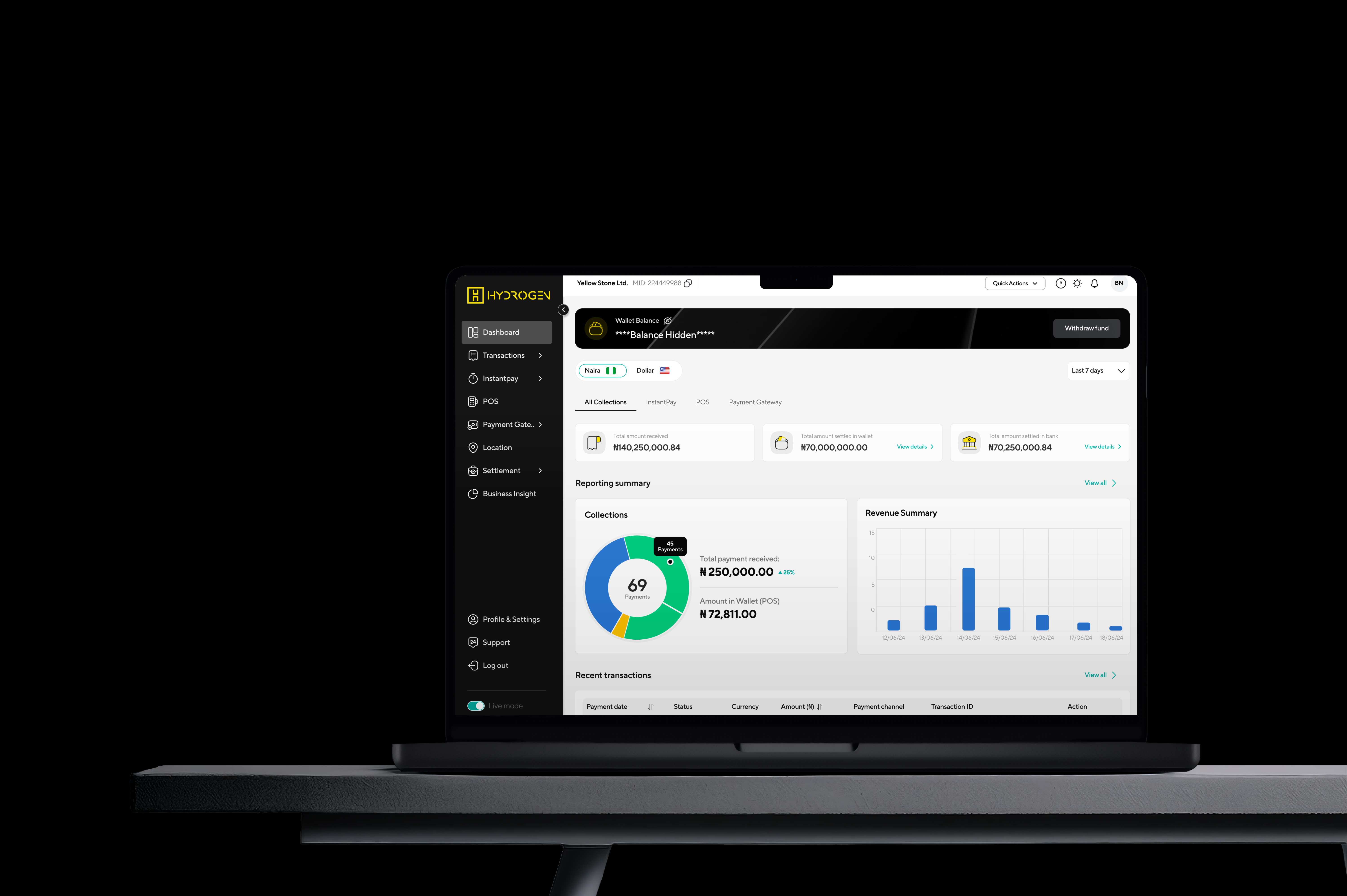
As Head of Product Design at HydrogenPay, I transformed an over-built, under-documented design system into a unified source of truth that accelerated collaboration across design, engineering, business, marketing, and leadership teams. What started as a broken Figma file that engineers couldn't implement became a comprehensive system with robust governance, documentation, and buy-in from all stakeholders—enabling consistent brand experiences across product, marketing campaigns, executive presentations, and data insights.
how we reimagined a design system at scale
from Understanding -> impact
As Head of Product Design at HydrogenPay, I transformed an over-built, under-documented design system into a unified source of truth that accelerated collaboration across design, engineering, business, marketing, and leadership teams. What started as a broken Figma file that engineers couldn't implement became a comprehensive system with robust governance, documentation, and buy-in from all stakeholders—enabling consistent brand experiences across product, marketing campaigns, executive presentations, and data insights.
Impact: 75% reduction in design-dev inconsistencies • Universal adoption across 6 departments • 50% faster campaign-to-market execution • Unified visual language across all customer touchpoints
Role: Head of Product Design | Team: 11 Designers, 4 Engineers, 3 PMs, Marketing, Data, Leadership | Timeline: 10 months
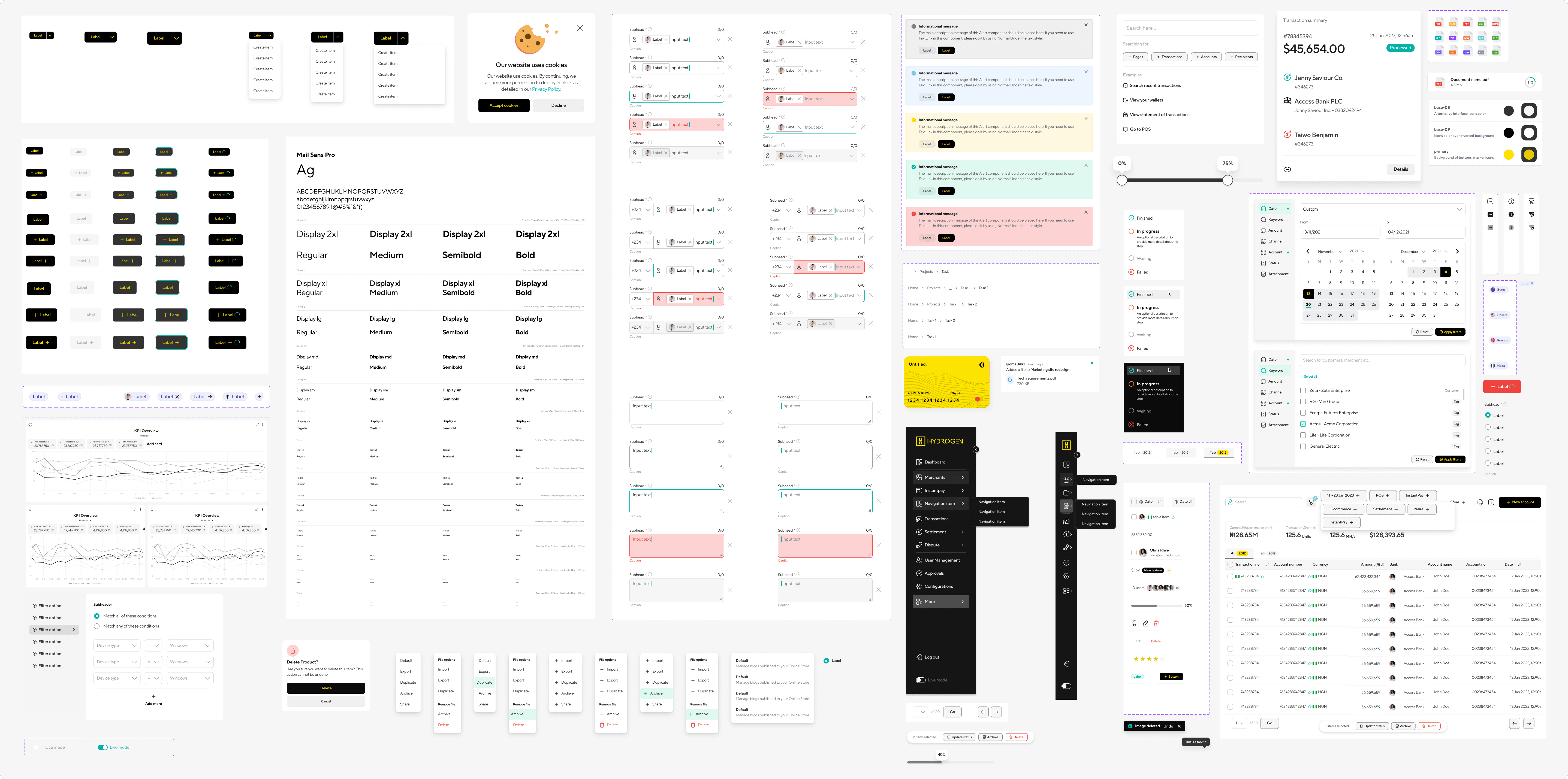
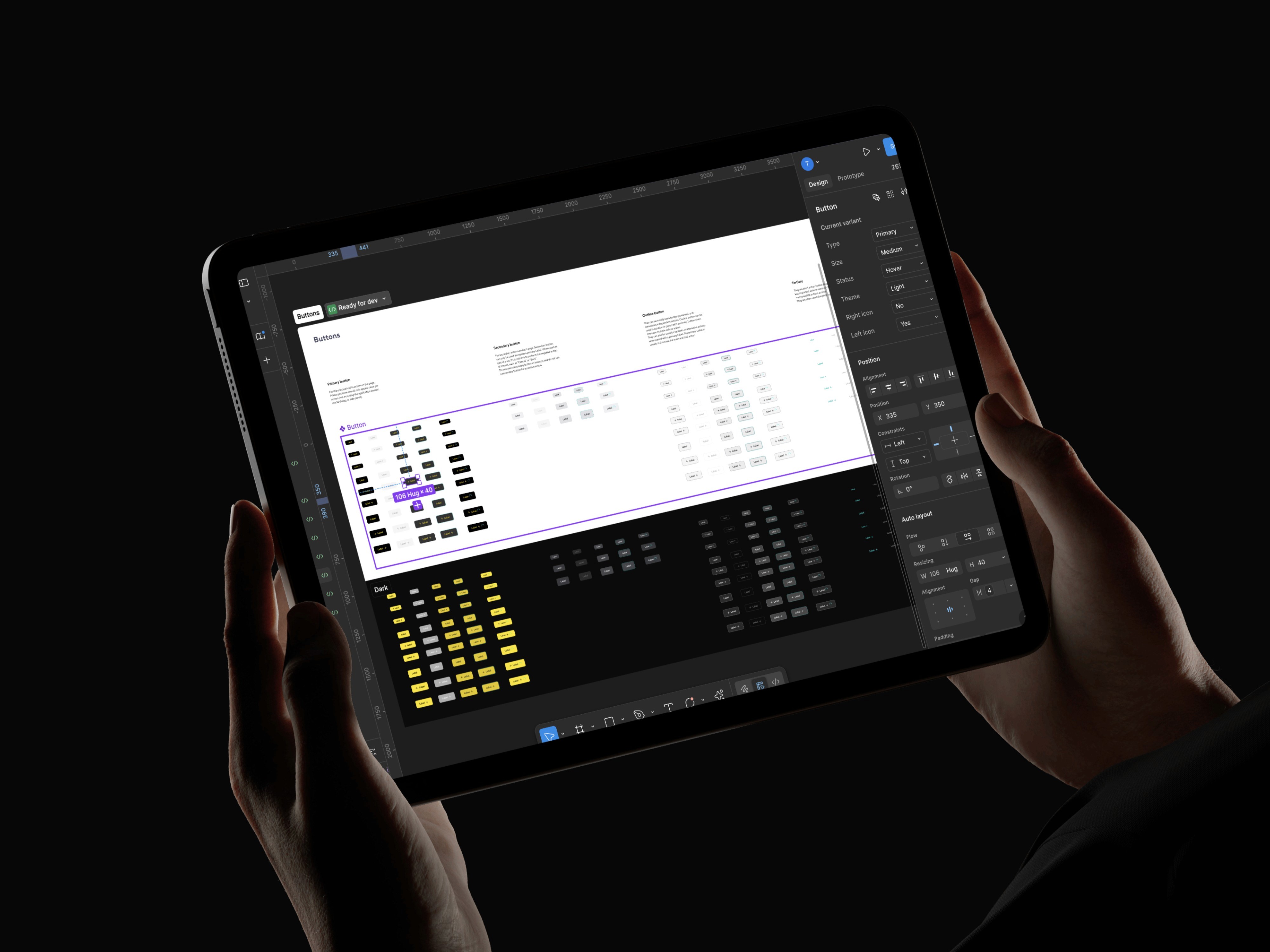
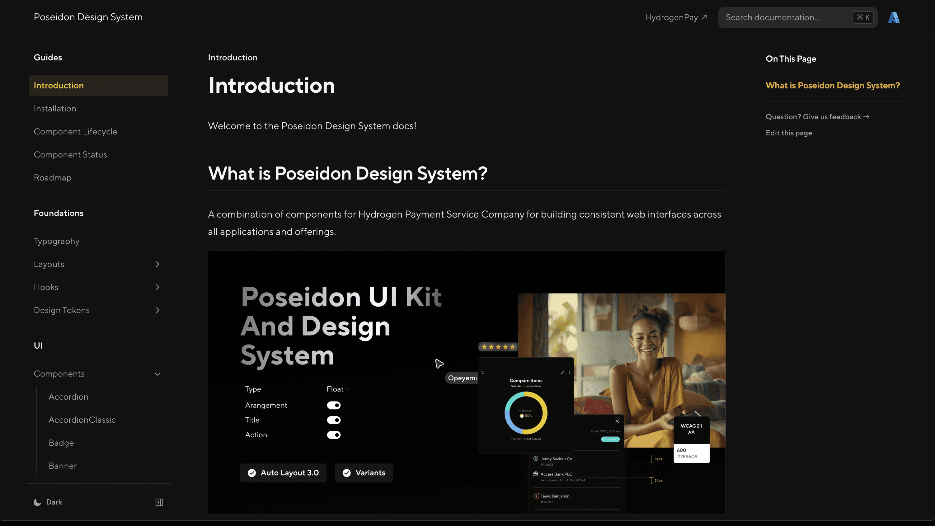
What is Poseidon? - Poseidon is a modular, token-based design system powering 10+ internal products with scalable components, consistent themes, and developer-friendly documentation.

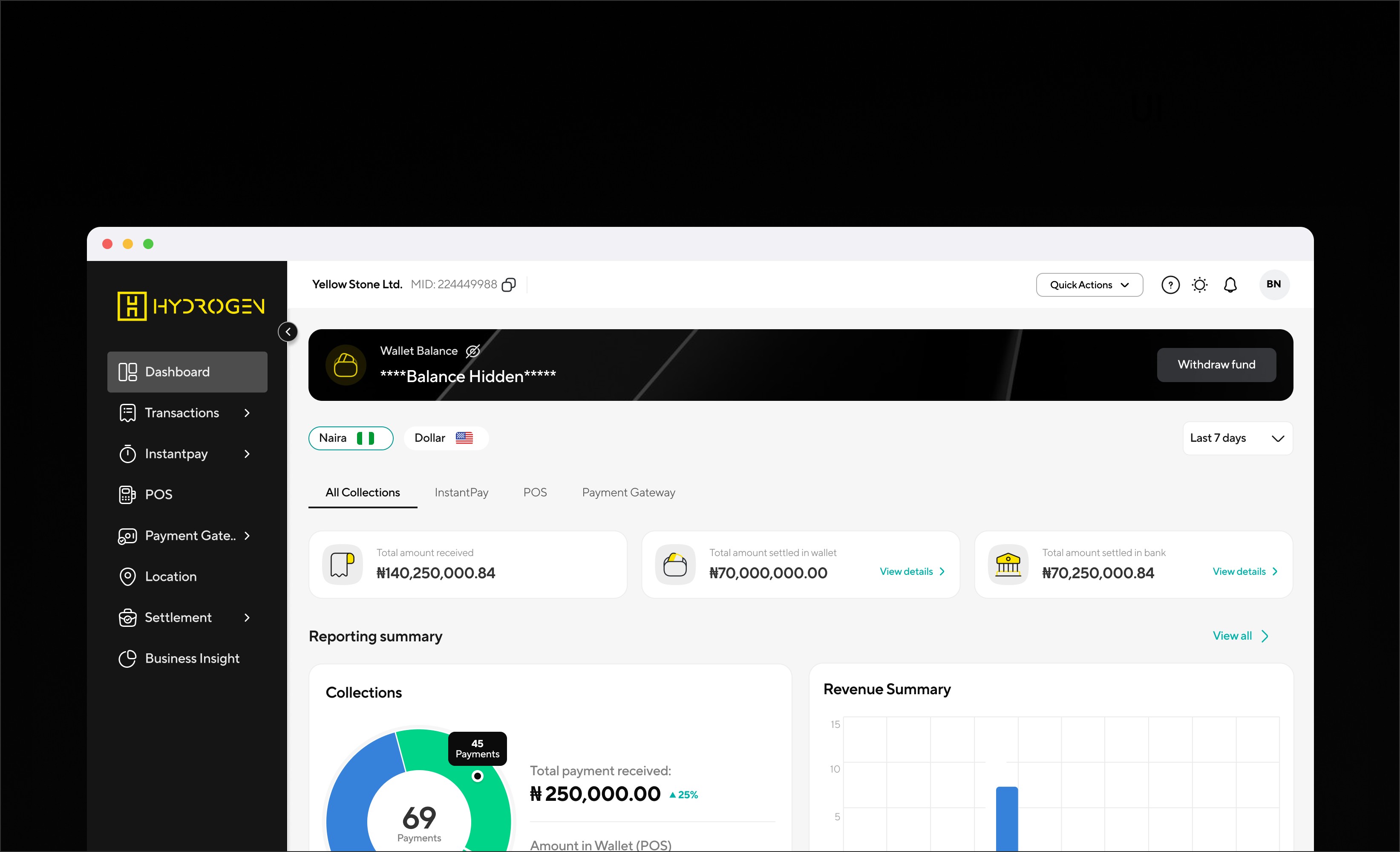
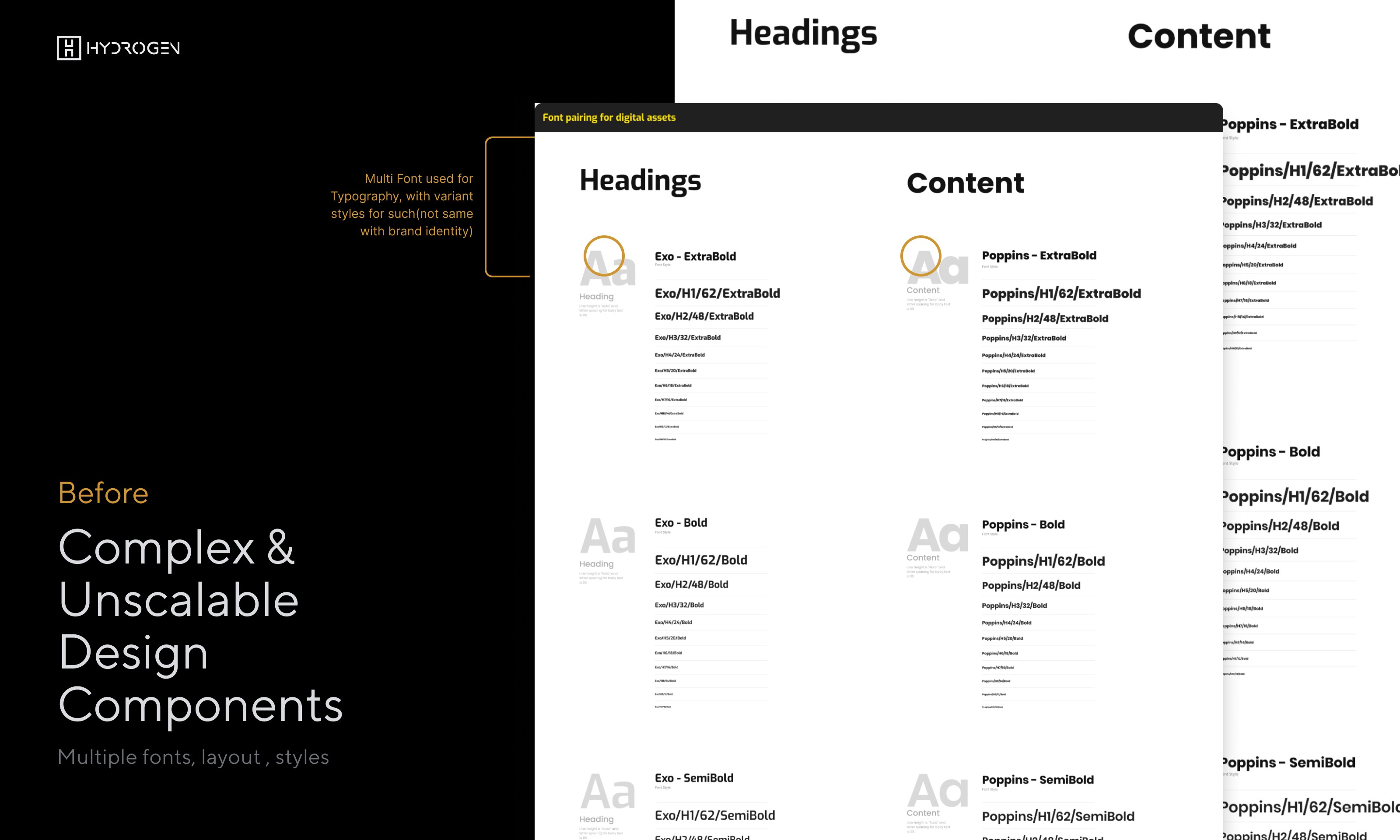
When i joined hydrogen I inherited a bloated, undocumented Figma file inherited from a ux design agency . Our design team was creating 47 unique button variants across products while engineers built custom components for each feature request. Marketing campaigns used off-brand elements. Leadership presentations featured inconsistent visual styles. Data reports looked foreign to our product experience.
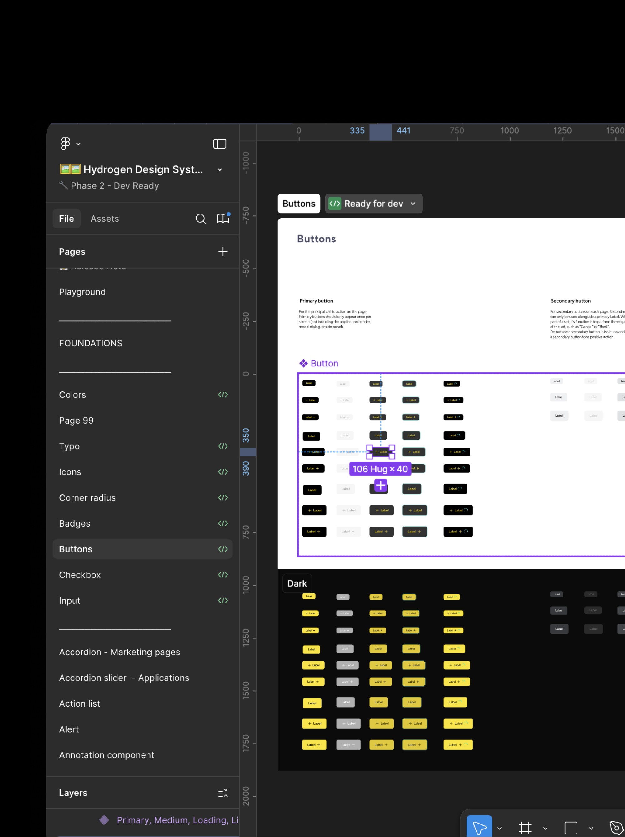
Most components lacked documentation. Where documentation did exist, it was directed at engineers for the immediate implementation of the component and was often out of date.
It was clear additional variants and options had been added over time but the documentation was never updated as well, leading to confusion about when to use which property and why.
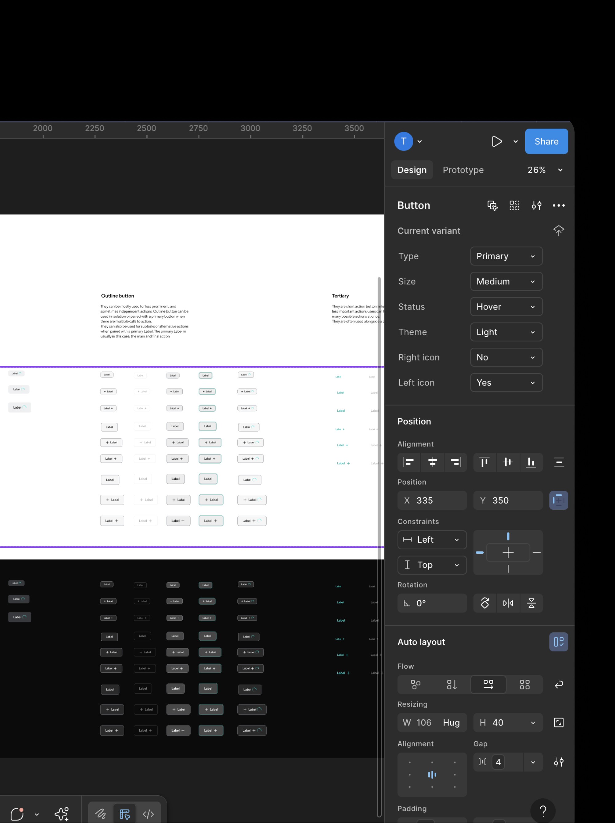
The components themselves were brittle and complicated. Components did not cascade, and as a result it was costly to make even minor adjustments to fix errors in the component. Any variations required breaking the component or adding onto the long list of properties.
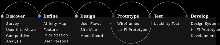
I follow a human-centered design methodology that integrates Lean Startup validation, Lean UX principles, and Jobs-to-be-Done framework to create products that solve real user problems while achieving business goals. My approach unfolds through three strategic phases:
Discover → Define → Design
It was clear additional variants and options had been added over time but the documentation was never updated as well, leading to confusion about when to use which property and why.
Map of all user types: Designers, Engineers, PMs, Marketing, Leadership, Data Teams - their pain points, goals, and current system touchpoints
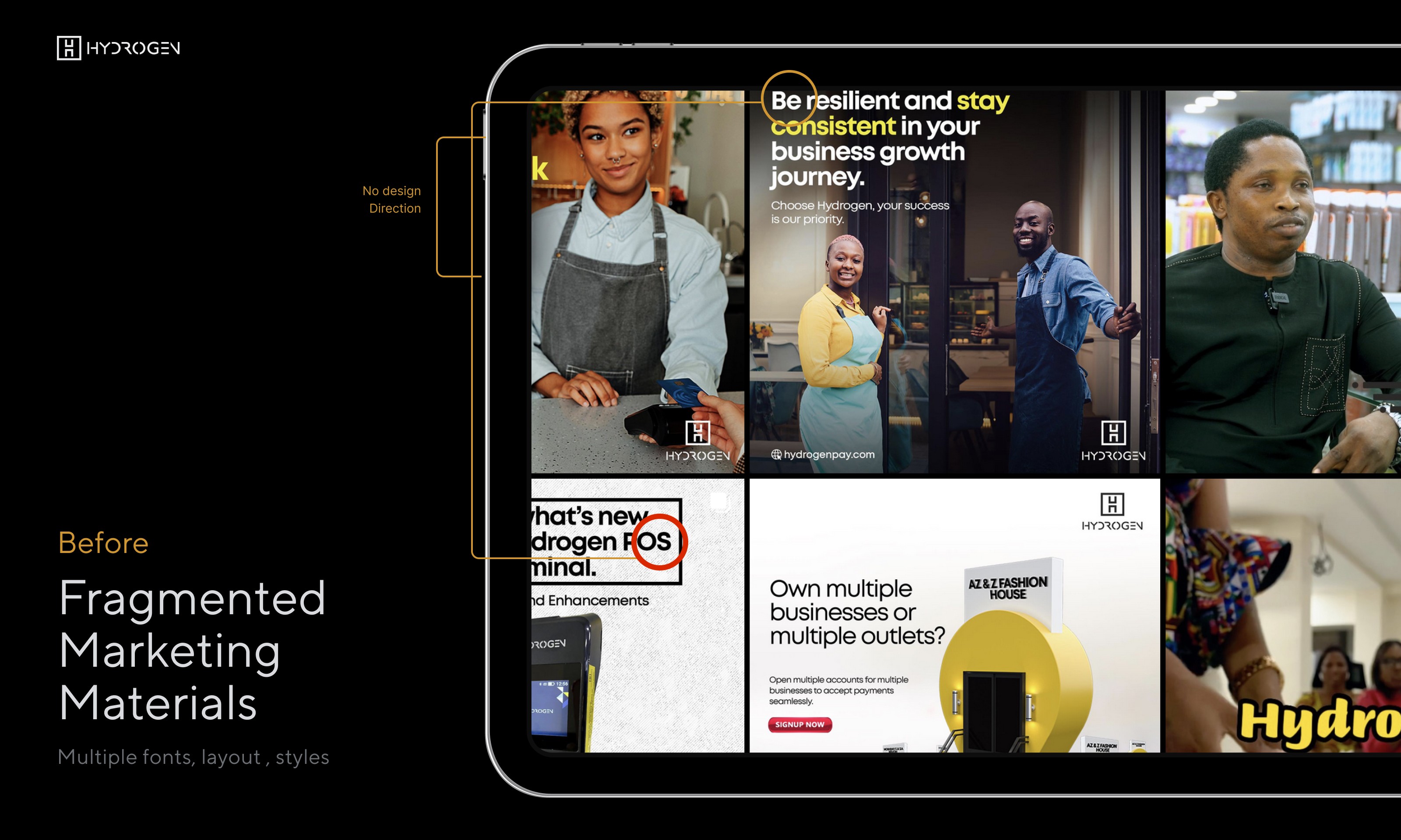
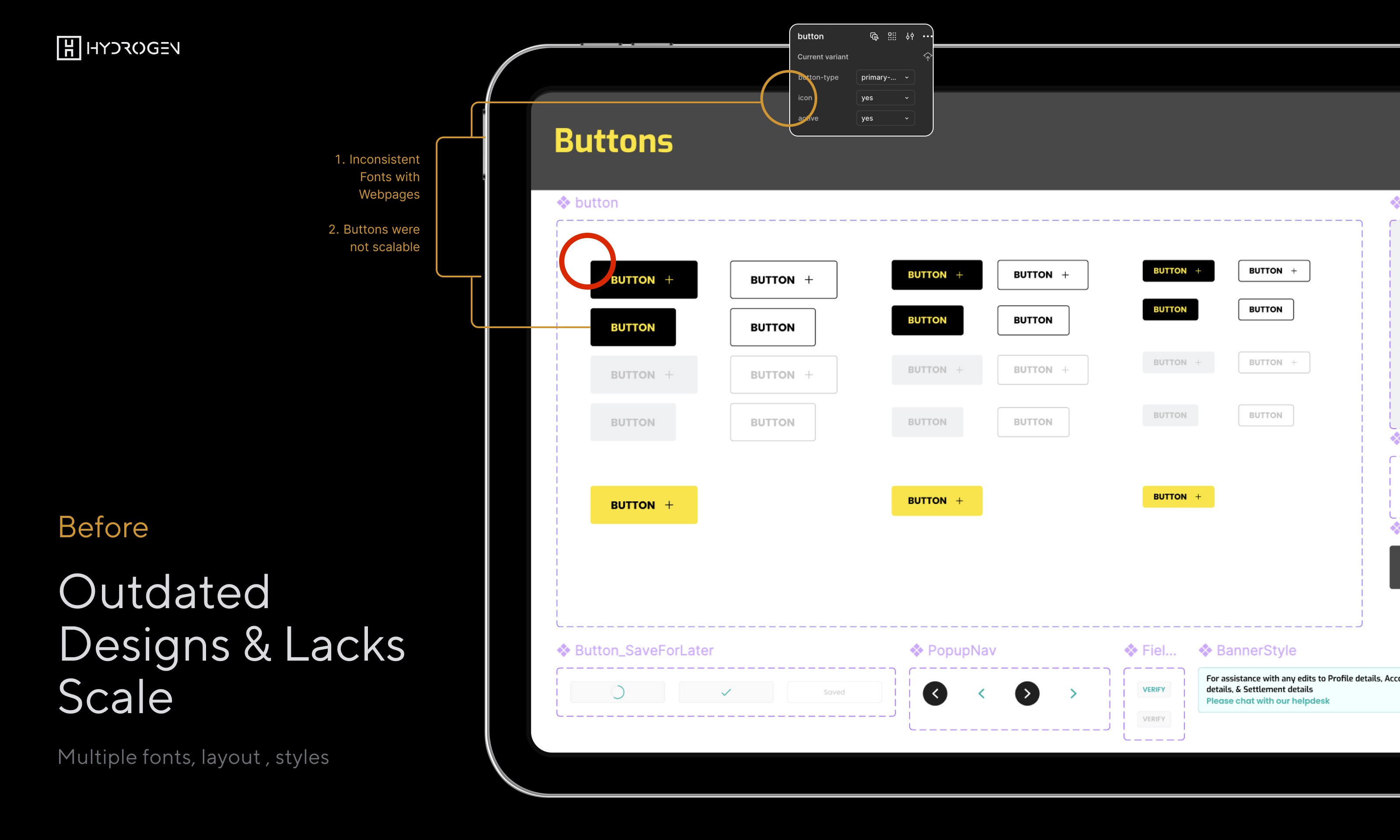
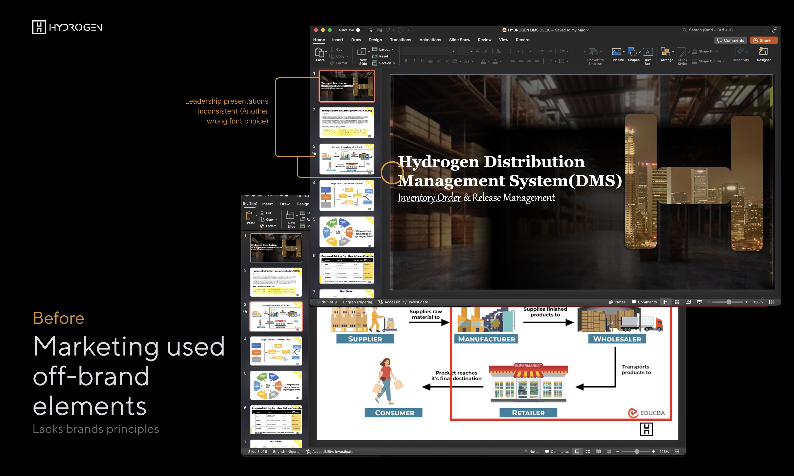
The most critical failure: A major investor presentation featured slides that looked nothing like our product, while simultaneously our mobile app launched with buttons that didn't match our web platform. In fintech, where trust and consistency drive conversion, we were presenting a fractured brand across every touchpoint.
40% design handoff rejection rate due to component inconsistencies
3 weeks onboarding time for new designers to understand component chaos
6 different brand interpretations across departments
Zero documentation for 80% of existing components
Stakeholder Research & Discovery
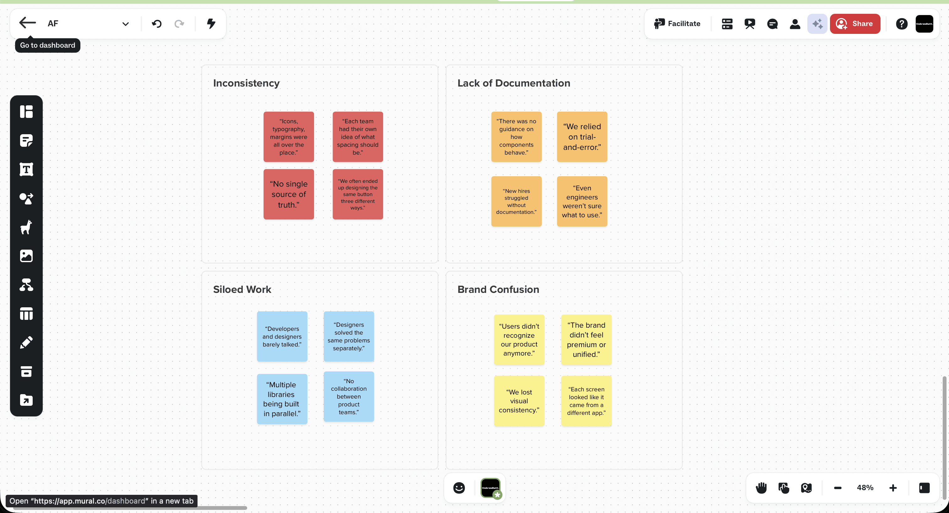
I led the team conducted 23 interviews across all departments (assigning Desmond to oversee Interview documentation on notion) to understand how our broken system impacted their daily workflows and business outcomes.
Affinity Mapping Clustered insights from interviews showing common pain points: Inconsistency, Lack of Documentation, Siloed Work, Brand Confusion
Working with a design systems engineer(Folafunmi) and the team, we cataloged all existing components and ordered them by criticality and sync status.
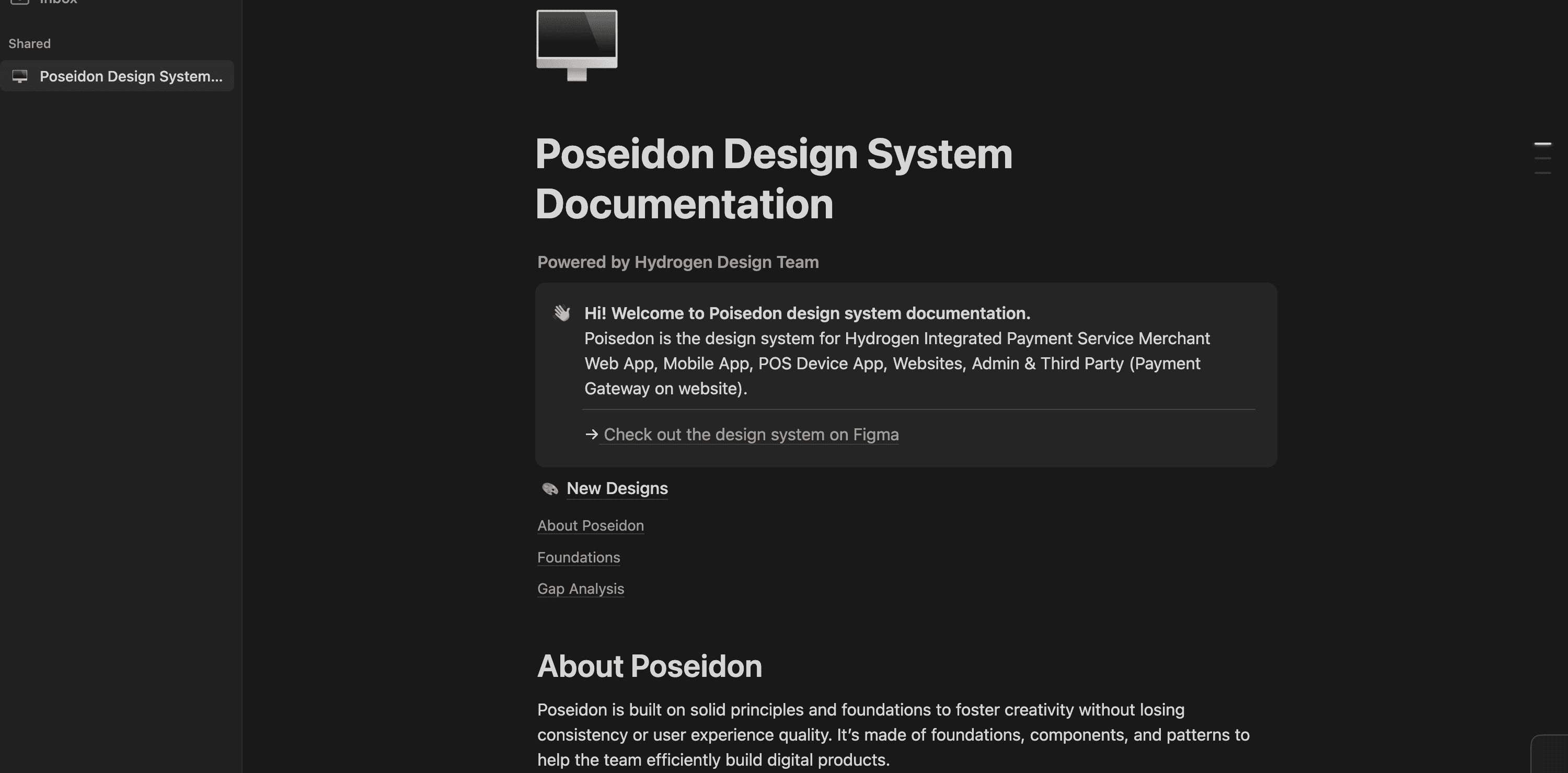
Most components lacked documentation. Where documentation did exist, it was directed at engineers for immediate implementation and was often out of date.
Components were brittle and complicated—they didn't cascade, making even minor adjustments costly.
Vision & Stakeholder Buy-in
To support this effort, I wrote an internal memo on our design system strategy and followed up with regular updates on progress. This supported the creation of a dedicated role in engineering and gained leadership commitment.
Stakeholder Journey Mapping Future state journey showing improved workflows across all departments

I established core principles focused on configurability over rigidity:
To support this effort, I wrote an internal memo on our design system strategy and followed up with regular updates on progress. This supported the creation of a dedicated role in engineering and gained leadership commitment.

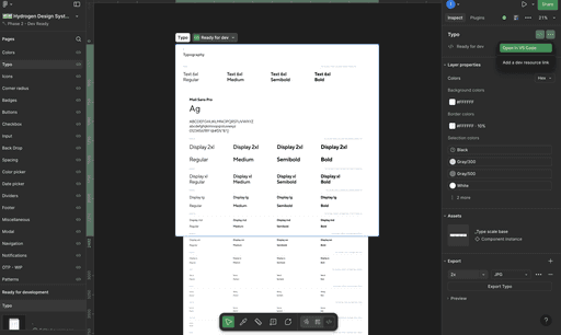



Design Principles Poster Visual representation of principles with examples
I established core principles focused on configurability over rigidity:
To support this effort, I wrote an internal memo on our design system strategy and followed up with regular updates on progress. This supported the creation of a dedicated role in engineering and gained leadership commitment.
Starting with highest priority components, I worked with front-end engineers to document each component in its current state and plan reconstruction.
I introduced slot components to address pace of new work while maintaining system integrity. Slot components allow teams to change content without impacting core structure—maintaining spacing and hierarchy while adapting purpose.
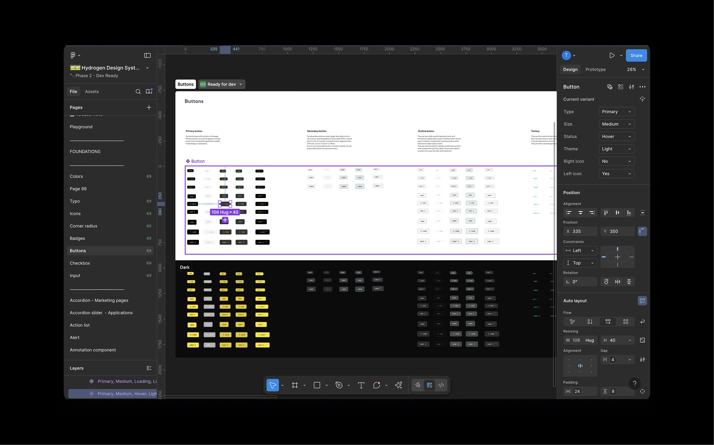
Component Architecture Flow Information architecture showing component hierarchy, relationships, and inheritance patterns
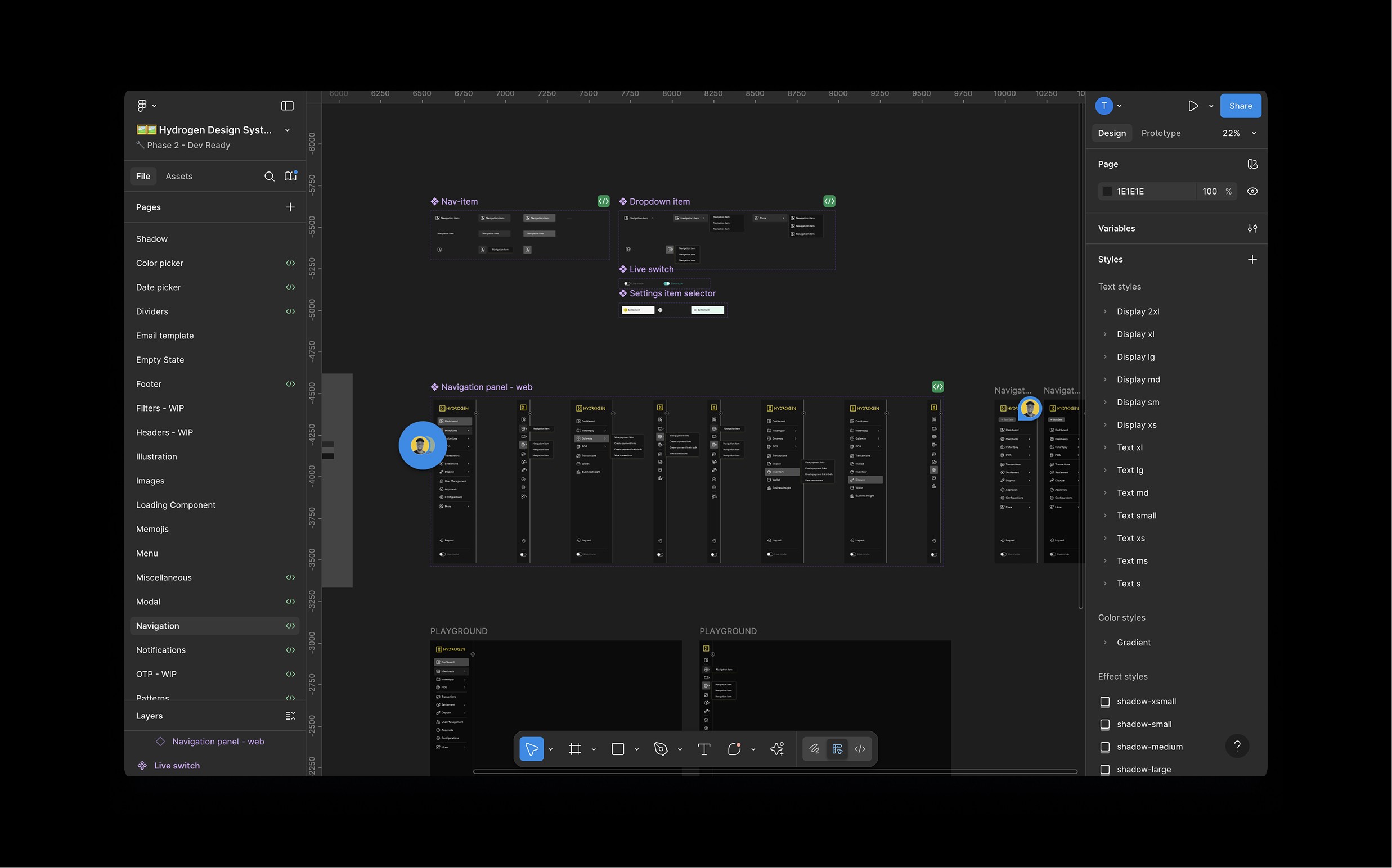
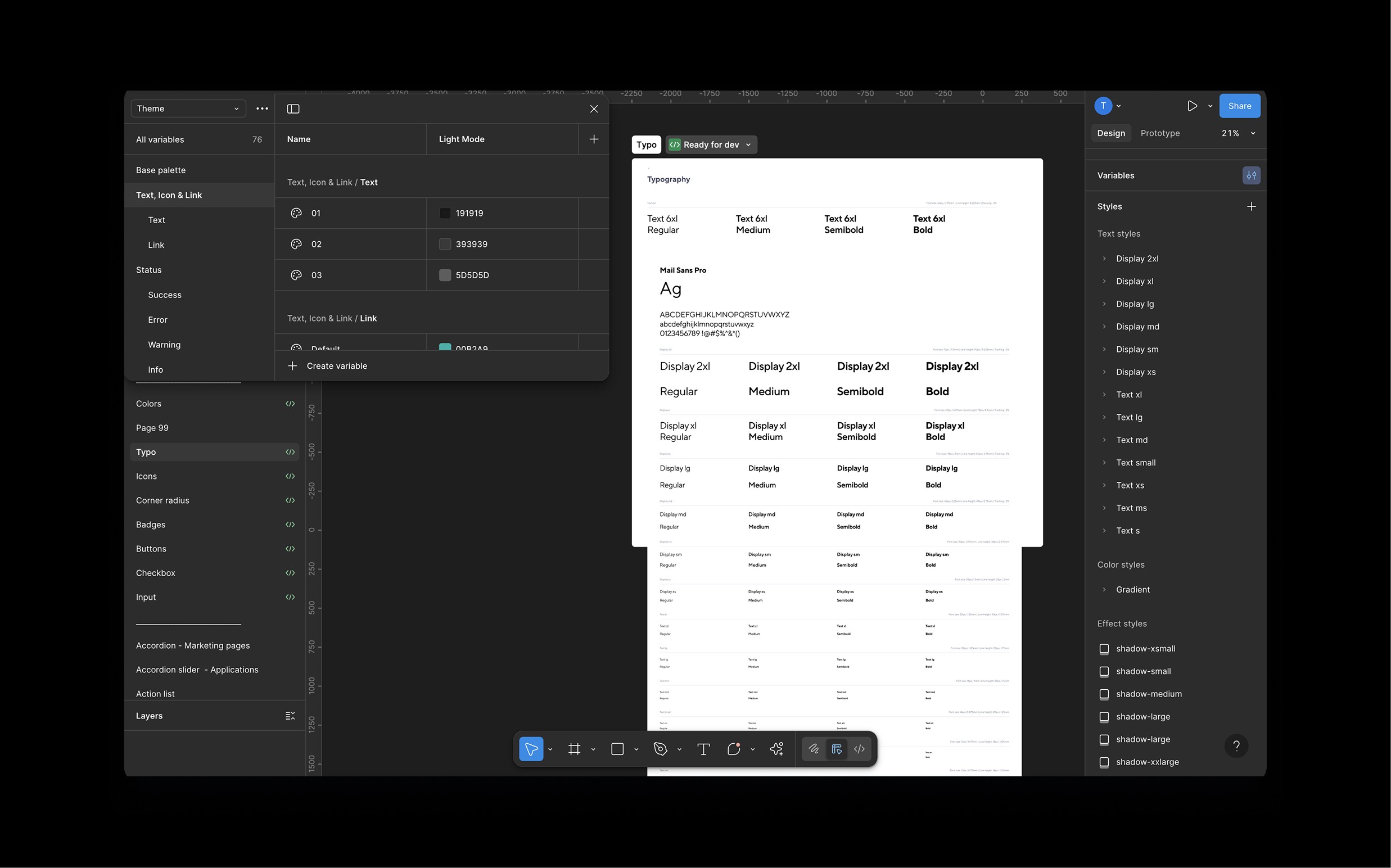
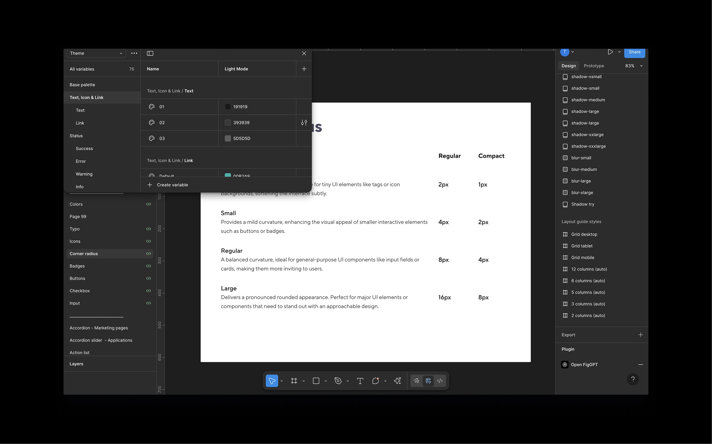
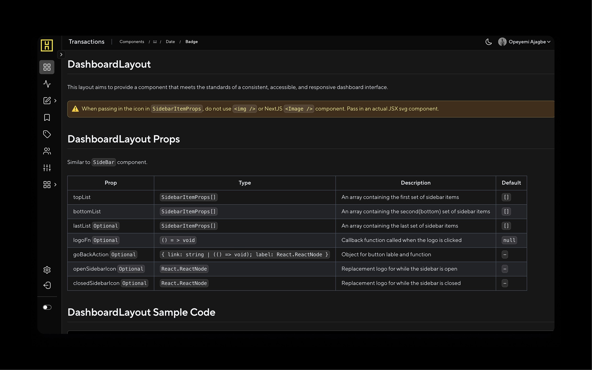
I assembled a comprehensive documentation system that anyone could reference, including:
Usage Guidelines: When and how to use each component
Semantic Differences: Clear distinctions between similar patterns
Contribution Standards: Rules for evolving the system
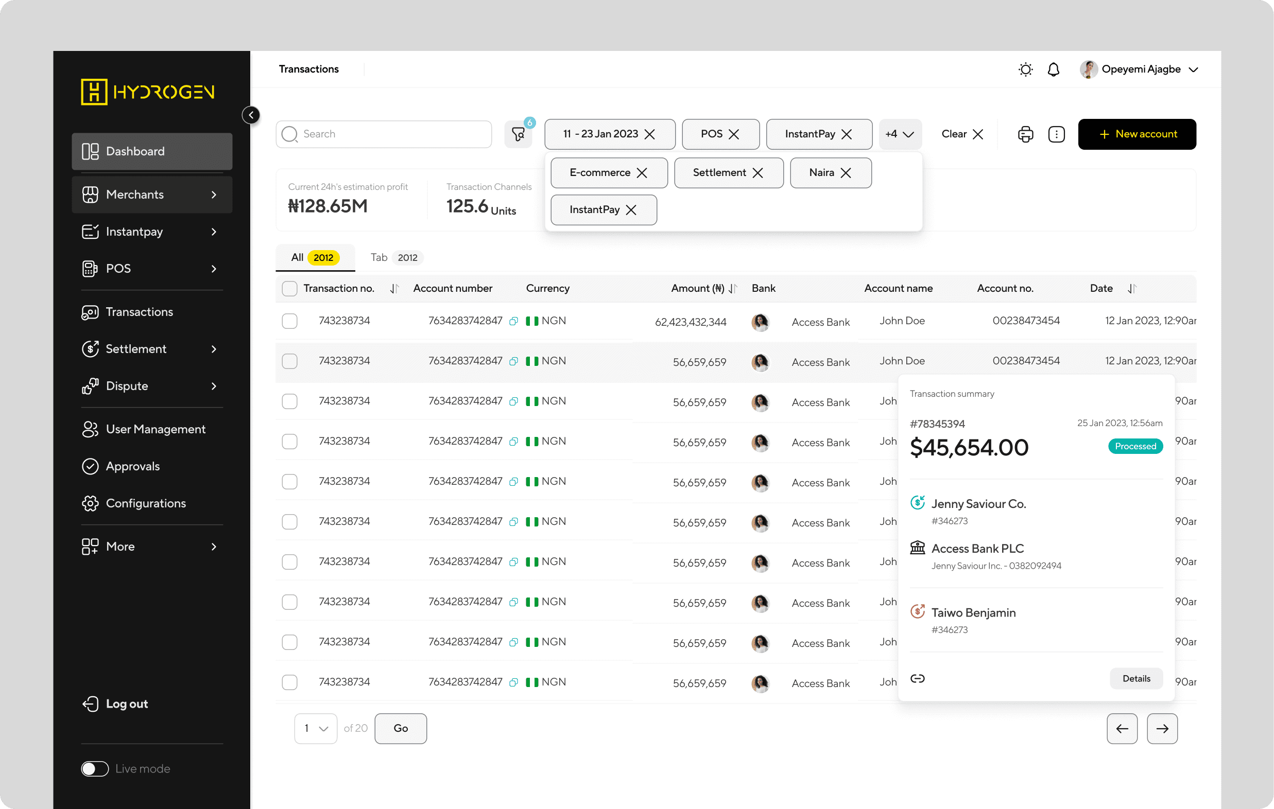
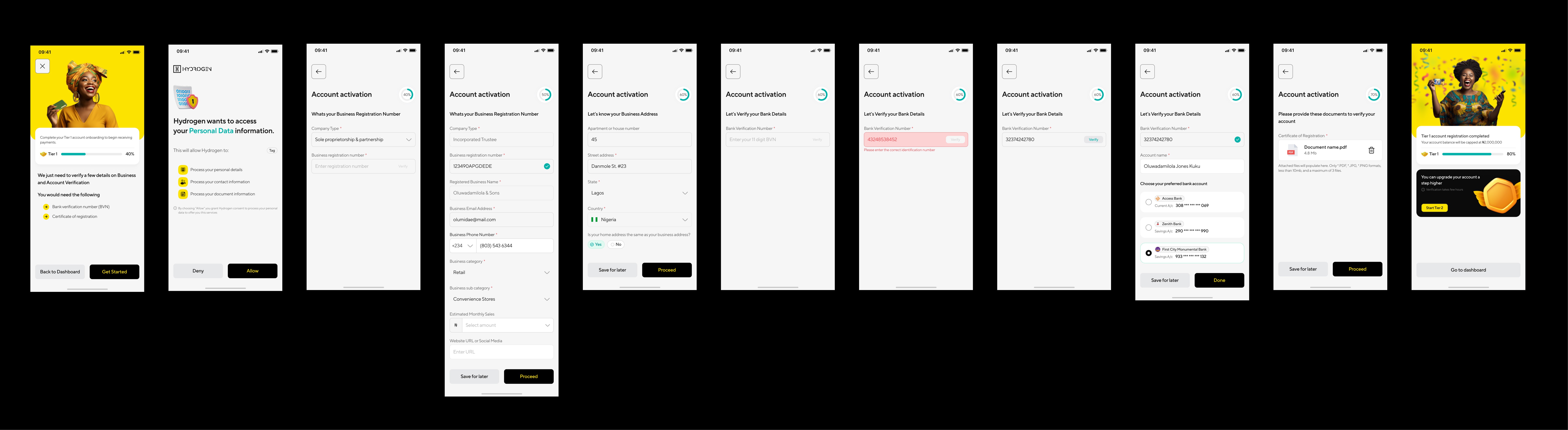
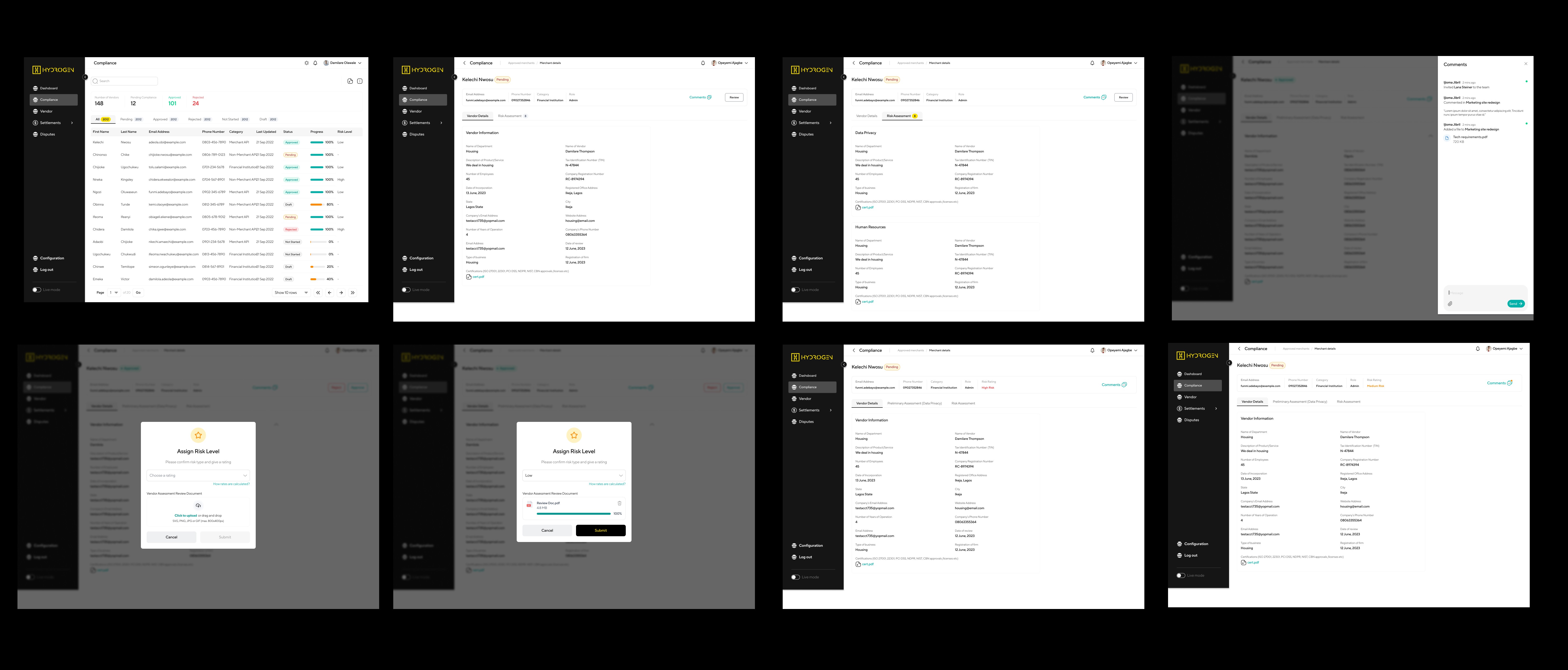
Cross-functional Applications: How components translate to marketing, presentations, etc.
Governance Process Flow Workflow showing: Proposal → Review → Approval → Implementation → Documentation
Updated design templates with dedicated space for component variations
Engineers gained visibility into suggested permutations for early feedback
Decreased component creep through intentional change management
I introduced slot components to address pace of new work while maintaining system integrity. Slot components allow teams to change content without impacting core structure—maintaining spacing and hierarchy while adapting purpose.
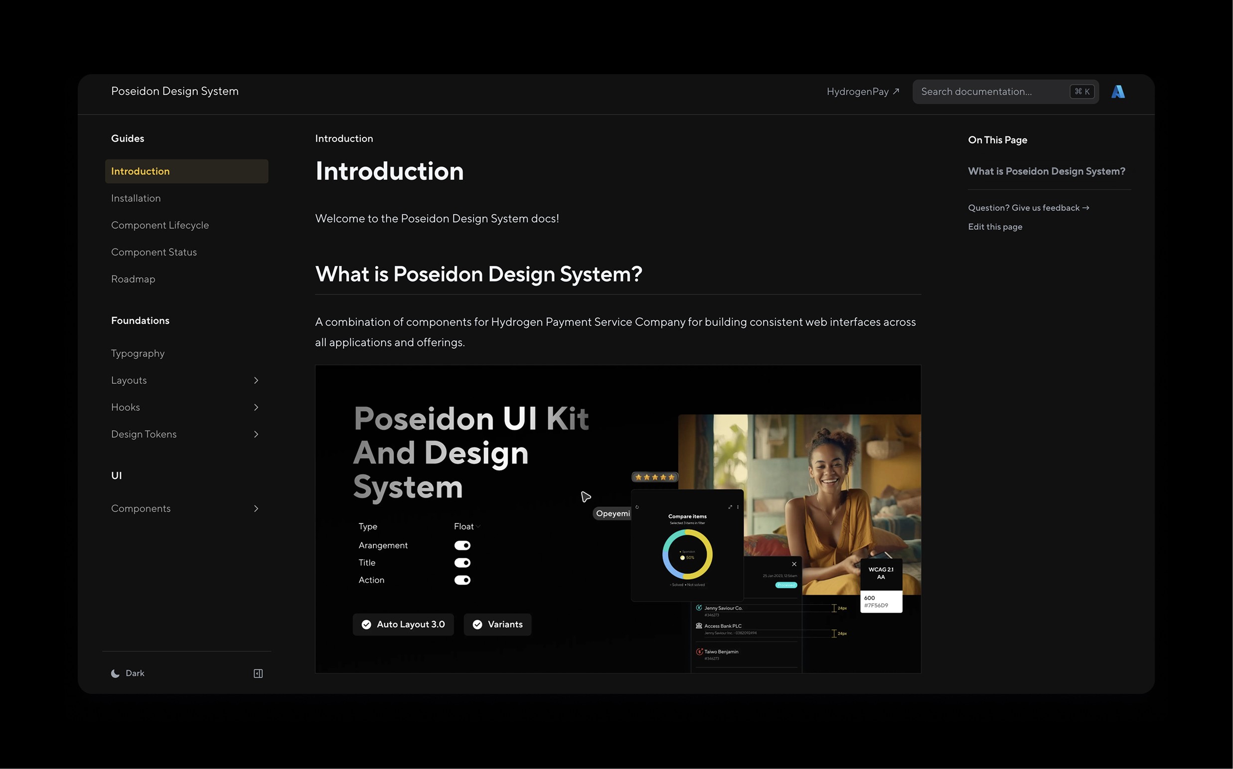
Information Architecture Site map of documentation system showing navigation and content structure
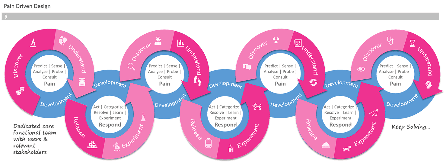
Engineering Partnership
I helped recruit and interview for a dedicated front-end role focused on coded component library, bringing shared language closer together. We established:
Storybook restoration with design-engineering parity
Token system connecting Figma to code
Quality gates preventing component drift
Collaboration Model Diagram showing design-engineering handoff process and shared responsibilities


Marketing Integration:
Campaign-ready component variations
Brand application guidelines
Asset generation workflows
Leadership Enablement:
Executive presentation templates
Branded slide components
Data storytelling standards
Quantitative Outcomes
95% component adoption across all product teams
75% reduction in design-dev inconsistencies
60% faster design-to-development handoffs
50% faster campaign-to-market execution
Zero design debt during system transformation
3 major product launches without quality degradation
Qualitatitive Outcomes
Increased stakeholder confidence in brand consistency
Improved collaboration between historically siloed teams
Faster onboarding for new team members across functions
Enhanced brand perception through consistent touchpoints
Success Metrics Dashboard Before/after metrics showing improvement across all KPIs
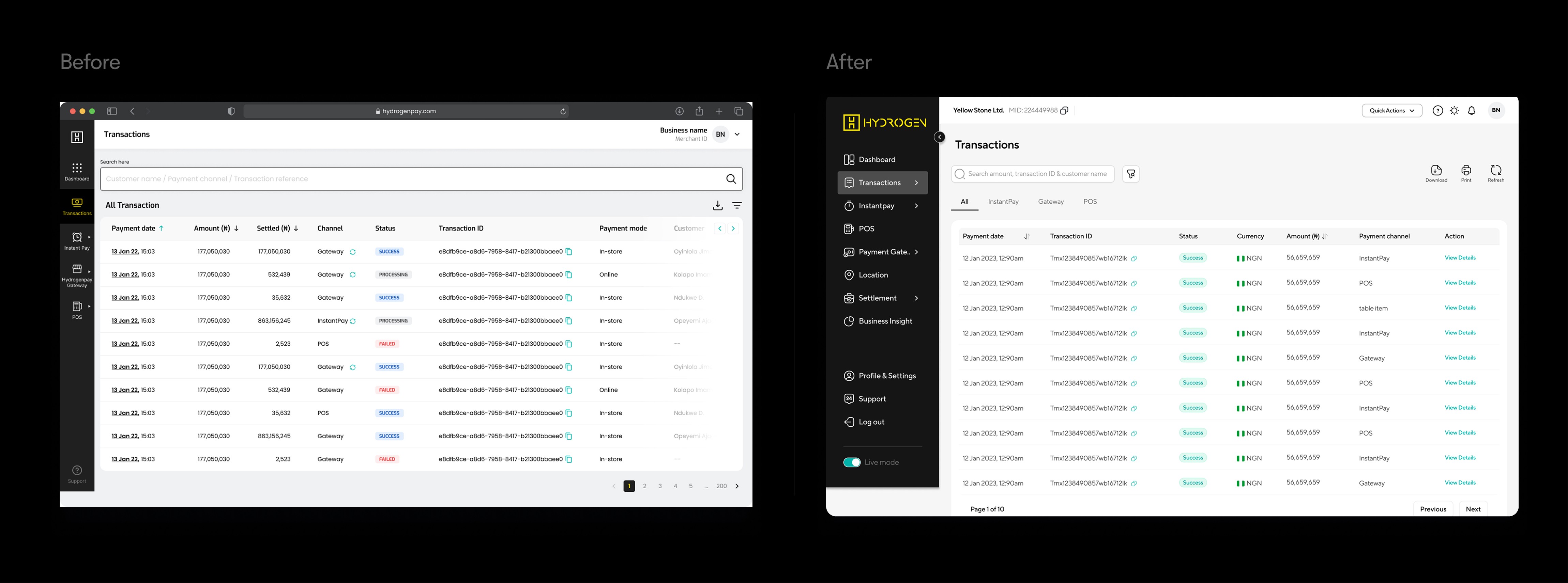
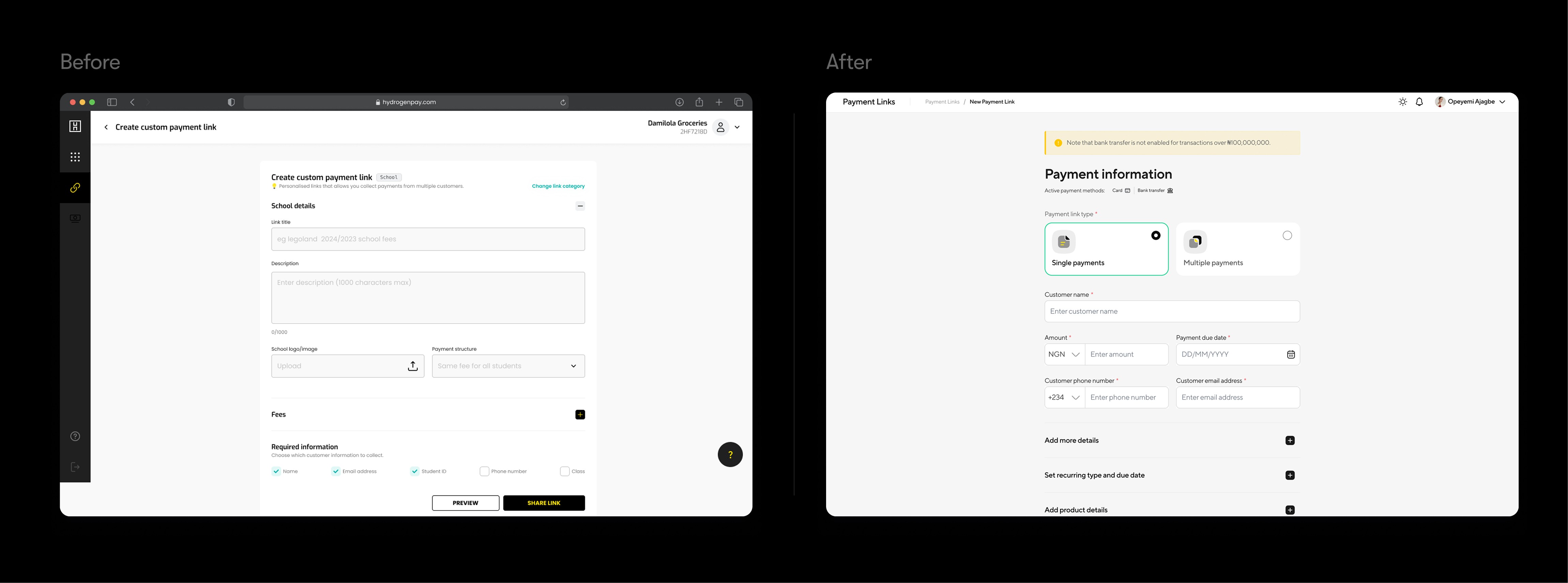
The unified system directly enabled HydrogenPay's rapid expansion while maintaining the trust and consistency critical in fintech. Leadership could confidently present to investors, marketing could launch campaigns that felt native to product, and engineering could ship features faster.
The anti-pattern I see teams fall into is focusing too much on the stuff of design systems—the components, libraries, and styles.
However, success hinges on the invisible parts: how to use it, when to evolve it, and why it matters for overall team success.
Iceberg Diagram Visual showing visible components above water, invisible processes below

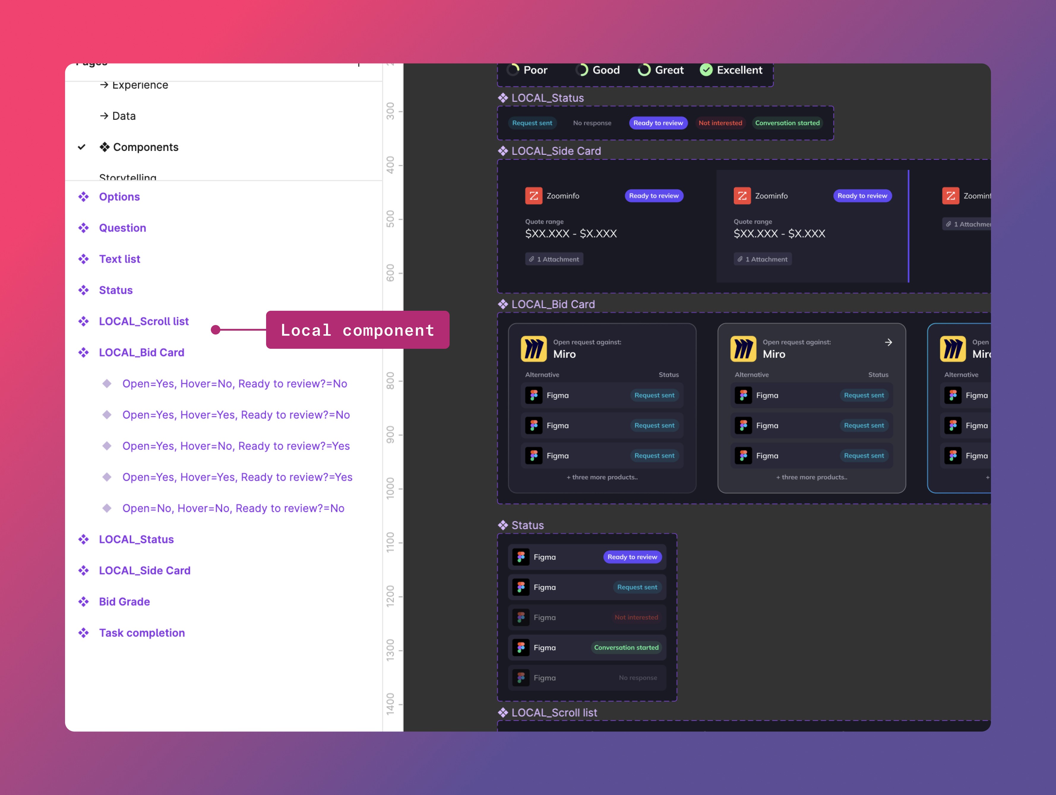
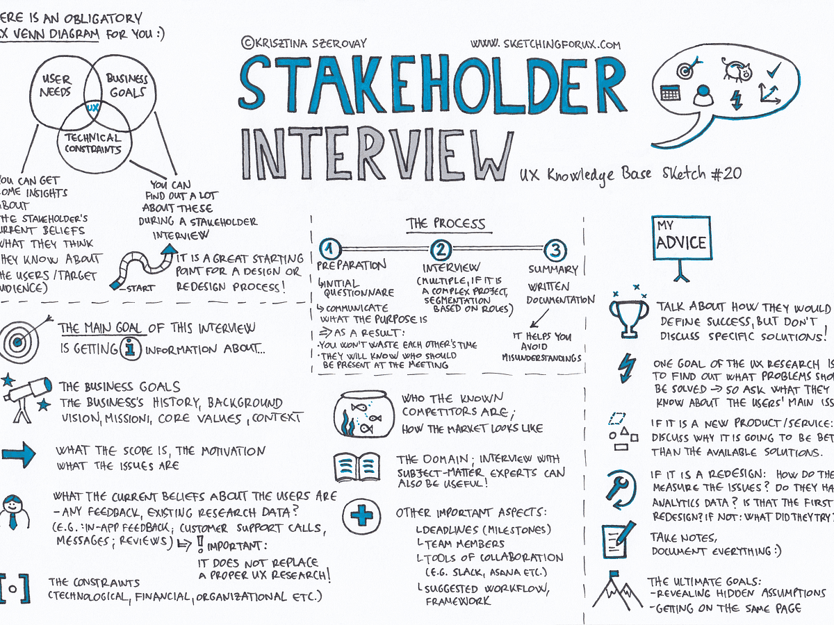
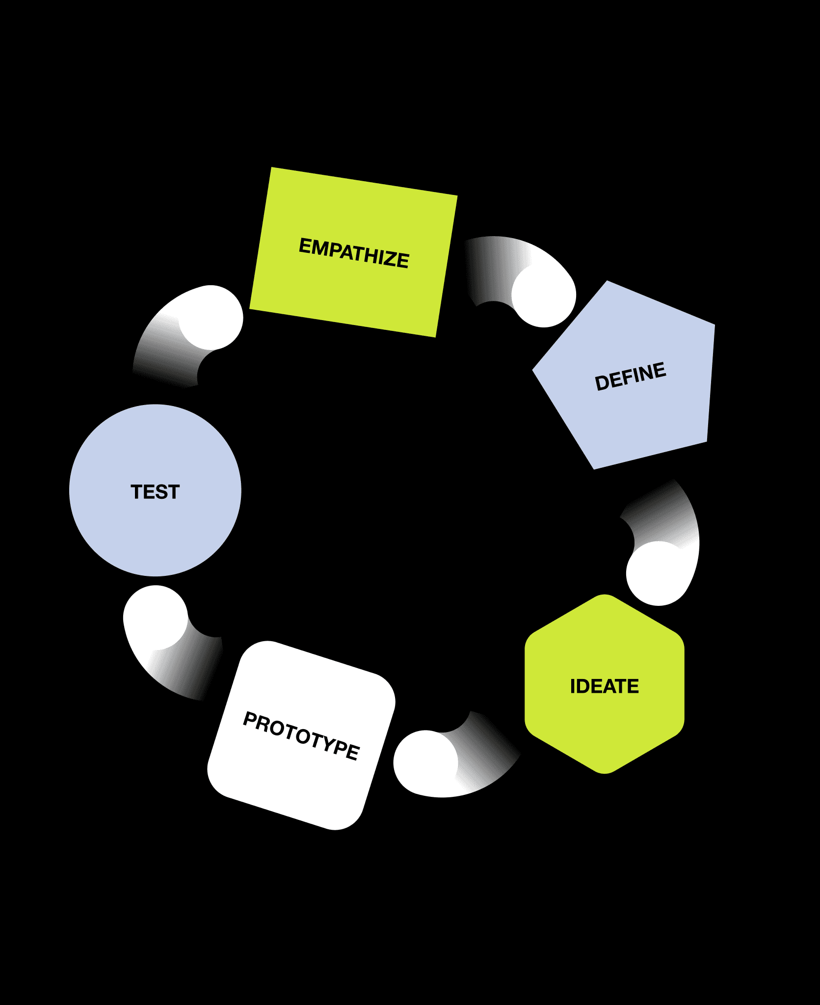
Once I had stabilized the state of the design system components and documentation, I focused on the processes and structure that would help us evolve it together.
To keep Poseidon sustainable, we implemented:
1. Contribution rules for new components
The team was not familiar with this new concept, so I wrote up how-to documentation and held a training on this Figma capability.
This transformation created a playbook for scaling design systems across complex organizations:
Transformation Playbook Step-by-step framework others can follow

Audit & Understand current state across all stakeholders
Build Coalition with leadership and key partners
Establish Principles that serve business needs
Implement Systematically with clear governance
Measure & Communicate value continuously




Transformation Playbook Step-by-step framework others can follow